Understanding human psychology is key to designing user experiences that convert. Behavioral science principles like hyperbolic discounting, the endowment effect, and loss aversion can make all the difference when tweaking product features, paywalls, or onboarding flows. In this post, I’ll walk you through some A/B experiment ideas I’ve developed for well-known apps.
Headspace: Making paywalls more compelling with hyperbolic discounting

The problem
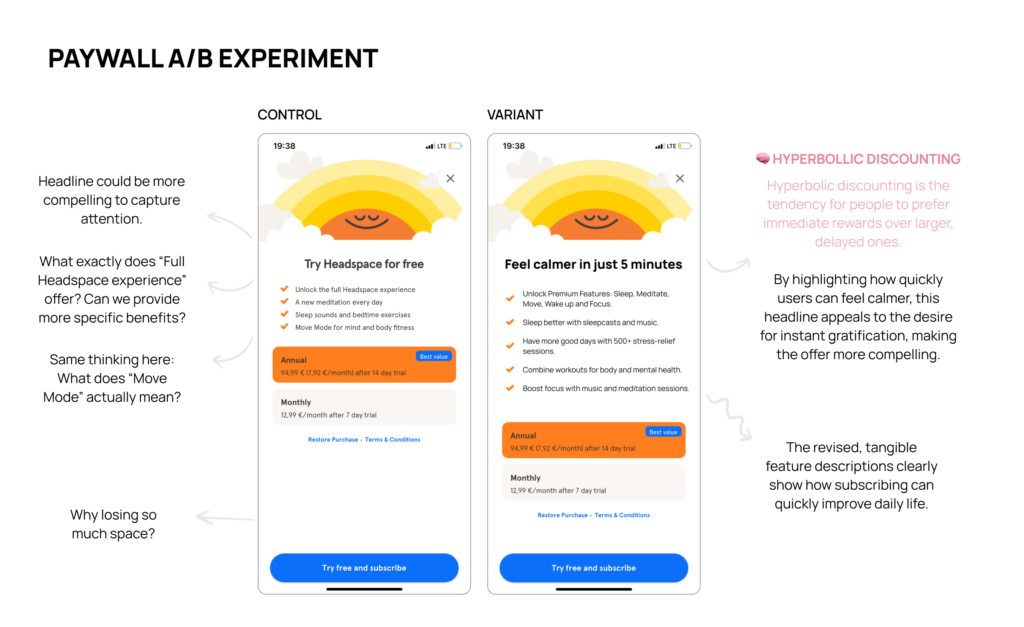
Looking at the original Headspace paywall, I noticed a couple of potential issues:
- The benefits aren’t clear.
The messaging is fairly general, and the user may not fully understand the value or practical impact of each feature. “Full Headspace experience” sounds too vague to resonate. - Feature names aren’t meaningful.
For example, “Move Mode” is mentioned, but as a first-time user, I have no idea what that is. It’s not helpful for someone unfamiliar with the app or its unique terms.
The solution
So, here’s what I did to improve it:
- Tweaked the headline to highlight immediate benefits.
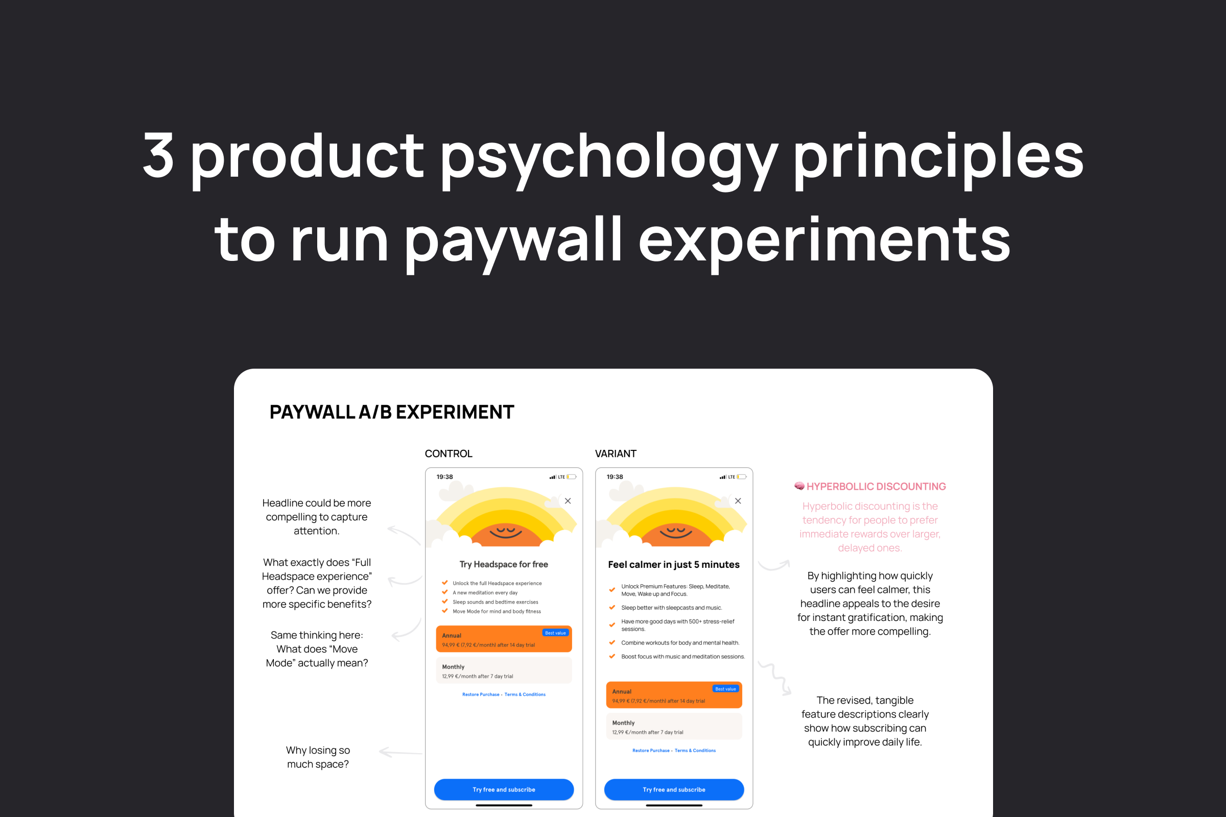
People are naturally drawn to instant rewards, a principle known as hyperbolic discounting. By changing the headline to “Feel calmer in just 5 minutes,” the paywall appeals to users’ desire for quick wins, making the value more tangible. - Reframed features as relatable benefits.
Instead of listing features like “Move Mode,” I emphasized specific user outcomes:
a) Sleep better with sleepcasts and music.
b) Boost focus with meditation sessions.
c) Combine workouts for both body and mental health.
These tweaks made the benefits more concrete and relatable, even for someone encountering the app for the first time.
Why this variant might perform better
This version works because it taps into users’ emotions and immediate desires. By addressing the human tendency to prioritize instant rewards, the paywall becomes more engaging and relatable.
Moreover, the shift from abstract features to clear, actionable benefits allows even first-time users to immediately understand why subscribing is worth it. This small change could result in more conversions and a stronger emotional connection to the product.
Strava: Using the endowment effect to boost paywall conversions

The problem
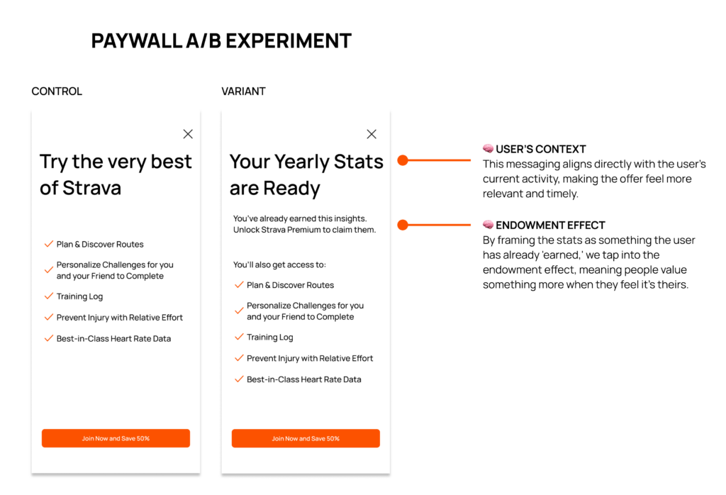
While browsing Strava, I hit a paywall while trying to view my yearly activity stats. The default messaging felt disconnected from what I wanted at that moment. Instead of addressing my immediate intent (accessing stats) it highlighted generic features like “Plan and Discover Routes” or “Training Log.”
This lack of contextual relevance and emotional connection likely reduced the chances of conversion.
The solution
So, here’s what I did to improve it:
- Tweaked generic headline to match users’s context.
From: “Try the very best of Strava.” To: “Your Yearly Stats Are Ready.”This revised headline speaks directly to the user’s context (viewing stats) and taps into the endowment effect by making the stats feel like something they already “own.”
- Adding subheadline highlight user has already earned that to.
Additionally, the messaging could highlight: “You’ve already earned this insights. Unlock Strava Premium to claim them.”
These adjustments make the paywall feel personal and relevant, aligning with the user’s immediate needs and emotions.
Why this variant might perform better
By making the paywall more contextual and emotionally resonant, it directly appeals to what users are thinking at the moment: “These stats are mine, I just need to claim them.”
This sense of ownership, combined with relevant messaging, creates a stronger psychological motivation to subscribe. Small changes like these can significantly boost conversions by meeting users where they are.
Pocket: Tapping into loss aversion to drive loyalty

The problem
Pocket is a fantastic tool for saving articles for later reading. But as a loyal user, I was surprised to realize that free users might not have permanent access to their saved articles.
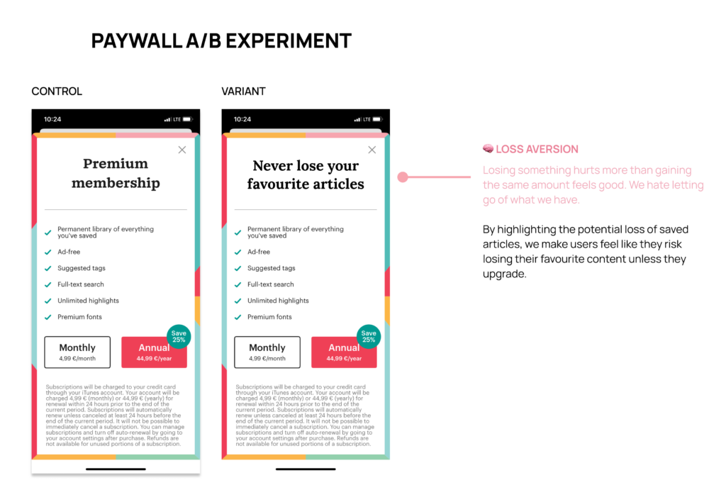
For many users, the ability to save and revisit articles is a key feature of Pocket. However, the current paywall messaging doesn’t emphasize the risk of losing this functionality, missing an opportunity to leverage a powerful behavioral science principle: loss aversion.
The solution
So, here’s what I did to improve it:
- Updating the headline to focus on preserving what users value most:
From: “Premium Membership.” To: “Never Lose Your Favorite Articles.”
The revised headline directly appeals to users’ emotions, tying the upgrade to something they care deeply about.
Why this variant might perform better
This approach works because it shifts the focus from generic features to the emotional stakes of losing something valuable. It’s not about the features—it’s about the connection users have with their saved articles.
By aligning the messaging with users’ fears of loss, this paywall could increase subscriptions and deepen loyalty.
Conclusion
Behavioral science can be a game-changer when it comes to optimizing key conversion points, such as paywalls, onboarding, pricing pages, and checkout flows. By leveraging principles like hyperbolic discounting, the endowment effect, and loss aversion, you can create experiences that align with how users think and make decisions.
Whether it’s emphasizing immediate benefits, creating a sense of ownership, or addressing users’ fear of loss, these strategies demonstrate how small tweaks can lead to meaningful improvements in user engagement and conversion rates.