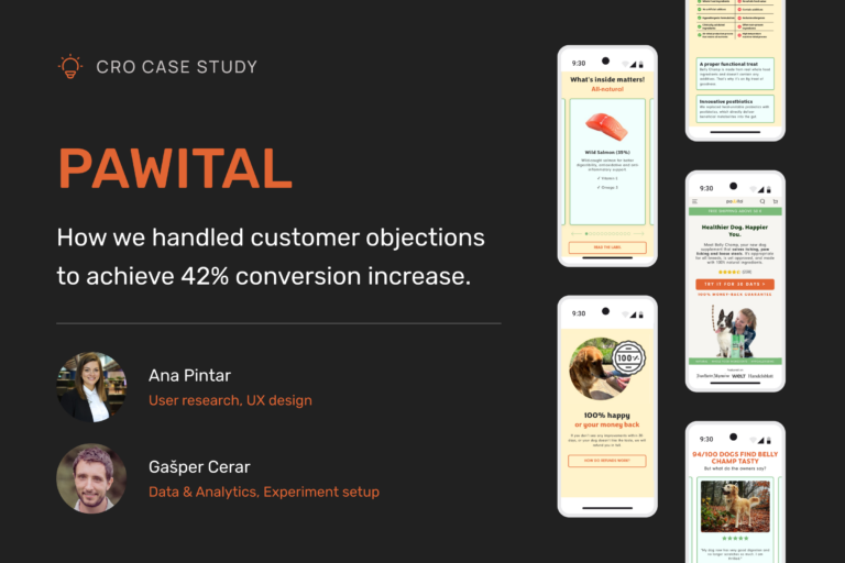
Pawital, a dog health supplement brand, aimed to increase conversions for its flagship product, Belly Champ. Through a comprehensive CRO project, we identified user objections, optimized landing page design, and refined messaging, resulting in a 42% increase in the add-to-cart ratio.
Introduction
Pawital is a company focused on improving dog health through scientifically-backed supplements. Their flagship product, Belly Champ, addresses common gut health issues in dogs, such as itching, paw licking, and digestive problems. Launched in 2024, Belly Champ is made with a blend of postbiotics, prebiotics, and wild-caught fish, and is recommended by veterinarians. Pawital, as an early-stage brand, is establishing itself in the pet care market by focusing on high-quality products that improve the overall well-being of dogs.
TL;DR
- Challenge: Communicate product value and improve comprehension to address user concerns directly on the landing page.
- Goal: Increase step completion from product page view to add to cart.
- Approach: Research-driven CRO methodology to identify objections and optimize design.
- Changes: Aligned ad and landing page messaging, added risk-free CTA, highlighted vet endorsements, structured reviews in a carousel, and emphasized money-back guarantee.
- Result: 42% increase in add-to-cart ratio in the German market.
- Lesson: CRO success hinges on storytelling, learning from each test, and addressing user concerns directly.
Challenge
Pawital faced a challenge in achieving profitability. With cheaper alternatives available, they needed to clearly communicate why Belly Champ was worth the premium price without overwhelming users with complex scientific jargon. Additionally, the landing page had to present a large amount of critical information in a clean and engaging way, without clutter.
We had to answer 2 key questions:
- What was the most impactful problem preventing users from converting? What were their objections and concerns?
- Why do people buy from the brand?
Our approach
To tackle these challenges, we used a structured CRO methodology with four phases: Research Sprint, Design Sprint, Implementation, and Experiment monitoring. We focused on uncovering user pain points through research, creating an optimized design that addressed those concerns, and then refining it through iterative testing.
At the heart of our process was our Experimentation Framework by Conversion, which allowed us to achieve clarity and alignment with Pawital, ensuring that our work was always focused on their most pressing goals.
- Web analytics (Google Analytics & Microsoft Clarity): We identified key drop-off points in the user journey, with nearly 90% of visitors abandoning the page before adding products to their carts.
- Customer feedback (support emails & online surveys): These revealed that users were concerned about ingredient suitability for their dogs, especially in relation to breed, health conditions, and efficacy.
- User interviews (buyers & non-buyers): We found that users were hesitant to purchase without clear proof of the product’s effectiveness and safety. Many were interested in vet endorsements and real user experiences.
1. Research sprint
During the research sprint, we analyzed:
- Web analytics (Google Analytics & Microsoft Clarity): We identified key drop-off points in the user journey, with nearly 90% of visitors abandoning the page before adding products to their carts.
- Customer feedback (support emails & online surveys): These revealed that users were concerned about ingredient suitability for their dogs, especially in relation to breed, health conditions, and efficacy.
- User interviews (buyers & non-buyers): We found that users were hesitant to purchase without clear proof of the product’s effectiveness and safety. Many were interested in vet endorsements and real user experiences.
Research revealed the main concerns:
- Product suitability: Users wanted to know if Belly Champ was appropriate for their dog.
- Ingredient safety: Specific concerns about ingredients like salmon and contraindications for certain health conditions.
- Product efficacy: Users needed reassurance that Belly Champ would deliver on its promises.
We also learned why people did buy:
- Natural ingredients and vet approval were strong motivators.
- Taste and visible improvements in their dog’s health were major selling points.
To address these concerns and drive conversions, we structured our insights into an experimentation framework that guided our next steps.
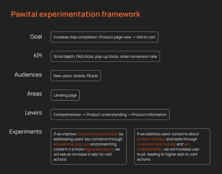
Based on our experimentation framework, our goal was to increase step completion from product page views to add-to-cart actions. We focused on key metrics like scroll depth and engagement, targeting new mobile users from Facebook ads. By addressing product comprehension and trust, we developed specific hypotheses to guide our design changes, ensuring they tackled the main user concerns.
2. Design sprint
Based on these findings, we implemented several key changes to the landing page design:
Hero and above the fold content
We initially designed the above-the-fold section following conventional CRO best practices, including elements like a store benefit announcement bar, an emotional headline, social proof, a money-back guarantee, and a product benefits slider. We believed this structure would be more comprehensible, highlighting key selling points and appealing to a broader audience with an emotional headline focused on overall product benefits.
- Announcement bar: We added an announcement bar at the top of the page to highlight free shipping, addressing common concerns about additional costs and reducing friction in the purchase decision
- Emotional headline: We changed the headline into an emotional one, believing it would appeal to a broader audience and better highlight the product’s overall benefits, potentially leading to improved performance.
- Subheadline: The subheadline specifically addressed users’ key concerns—whether Belly Champ was suitable for their dog and if it would work. By incorporating reassurance on suitability and product efficacy, the subheadline helped reduce hesitation and increase trust
- Added Social Proof: We integrated star ratings into the above-the-fold section to build immediate trust with visitors. This reassured them right away that others had positive experiences with Belly Champ, without overwhelming them with too much information upfront.
- Changed the CTA: We switched the call-to-action from “Get Belly Champ now” to “Try Belly Champ,” emphasizing a low-risk trial with a money-back guarantee. This directly addressed users' fear of wasting money.
- Product benefit slider: We incorporated a product benefit slider to visually showcase Belly Champ’s top features, such as natural ingredients, vet approval, and quick results. This slider gave users a quick overview of the product’s value, reinforcing the reasons to purchase without overwhelming them with text.
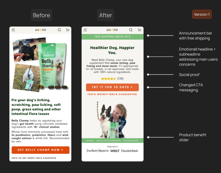
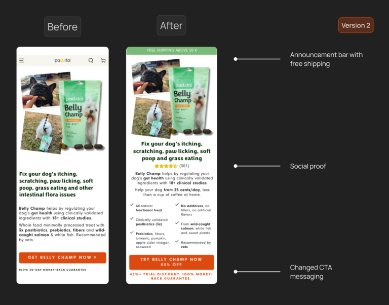
After running the experiment for 3 weeks, we noticed poor performance on the variant version. We assumed that the new above-the-fold content was too generic. We learned that aligning the messaging with the ad’s specific focus on customer pain points was crucial for driving conversions. This disconnect resulted in lower engagement, as users didn’t immediately see their specific concerns reflected on the landing page. We quickly adjusted the design by reinstating the content of the original above-the-fold content with some structural changes to better align with the ad messaging, while retaining some of the changes and performance was way better. And this was our first important learning lesson.
Moved vet endorsement higher on the page
Since vet approval was one of the strongest trust signals, we moved this section higher up on the page to ensure users saw it early in their journey. We also added subtitles, a thumbnail, and made it a horizontal layout to make it more user friendly.
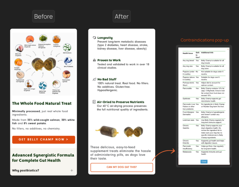
Added a “Can my dog eat this?” modal
To address users’ concerns about product suitability for specific breeds or health conditions, we introduced a modal that answered the question “Can my dog eat this?” This interactive FAQ reduced hesitation and helped users feel confident in their purchase decision.
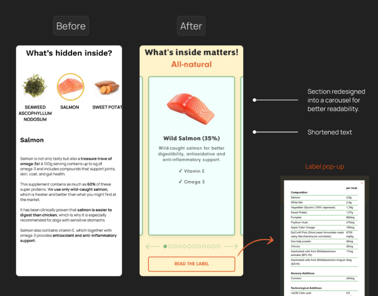
Simplified the ingredients section with a label modal
We streamlined the ingredients section to make it more digestible while adding a label modal that allowed users to dive deeper into specific components. This addressed concerns about ingredient safety, especially for dogs with sensitivities.
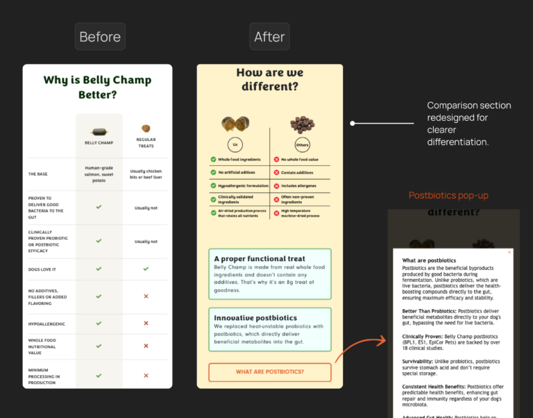
Redesigned the “How are we different” section with a postbiotics modal
One of Belly Champ’s unique features was its use of postbiotics, but users were unclear about what this meant. We redesigned the “How Are We Different” section and added a “What are postbiotics?” modal to educate users on its benefits in a simple, engaging way.
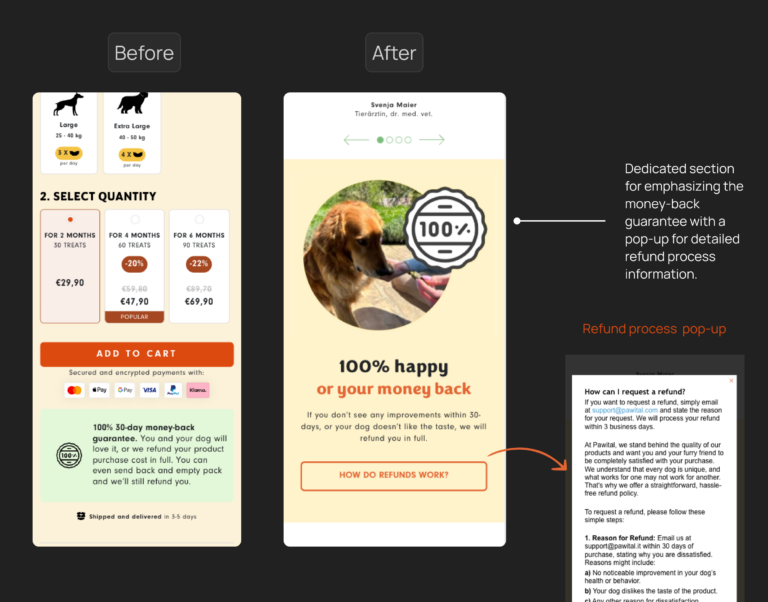
Increased emphasis on the money-back guarantee
As shown in the image, the money-back guarantee was initially part of the buy box. However, research revealed that users’ main concerns were, ‘What if it doesn’t work?’ and ‘What if my dog doesn’t like the taste?’ In response, we created a dedicated section for the guarantee and added a pop-up explaining the refund process. This approach was designed to minimize perceived risk and boost conversions.
Reframed the customer review section
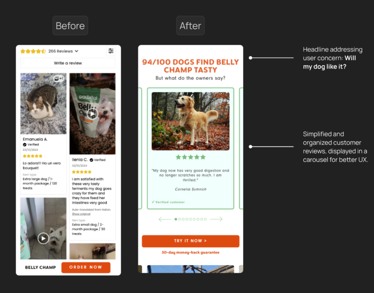
Initially, the customer reviews section was a never-ending list imported directly from the internal website’s product reviews, resulting in poor UX and a lack of structure. We chose to highlight only a few reviews that specifically addressed users’ key concerns, like ‘Will my dog like the taste?’ and ‘Does it work?’ Additionally, we changed the layout to a carousel for a more user-friendly experience and reframed the section title to answer the most frequently asked question about taste
Results
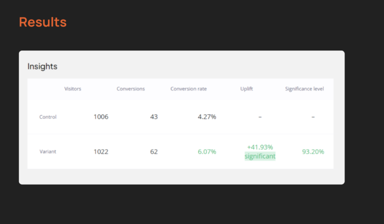
As already mentioned above, in our first experiment, we encountered poor performance due to a mismatch between the ad messaging and the headline in the above-the-fold section. The ad focused on specific pain points, but the headline was too generic, causing users to disengage. This signaled that a change was needed. In the next version, we aligned the messaging more closely with the ad and reverted to the original above-the-fold content. As a result, we saw a 42% improvement in the add-to-cart ratio in the German market.
Lessons learned
Align the ad with the landing page to tell a consistent story
One of the most significant takeaways from this project is the importance of maintaining a seamless narrative between your ad and your landing page. Initially, we followed conventional CRO guidelines, designing the above-the-fold section with elements like a store benefit announcement bar, an emotional headline, social proof, a money-back guarantee, and a product benefits slider. However, we neglected to ensure that the headline continued the story introduced by the ad. While the ad addressed a specific customer pain point—dogs with itching and scratching issues—the landing page didn’t reflect this narrative.
For example, the Facebook ads effectively showcased the customer’s pain points through videos of dogs itching and scratching, which resonated well with the target audience. However, the messaging on the landing page didn’t align with these specific pain points. Instead, it was too general, with headlines like “Happy Dog, Happier You,” which didn’t carry forward the story from the ads. As a result, this disconnect led to weaker performance compared to a version of the landing page that directly addressed the same pain points featured in the ads.
The key lesson here is that landing page optimization isn’t just about following general best practices, but also about ensuring a consistent, compelling story between your ad and the landing page. Both should work together as parts of a cohesive user journey to engage users and drive conversions.
Balance research with quick wins
While thorough research is essential for any conversion rate optimization (CRO) project, there’s a balance to be struck between deep insights and acting on quick wins. In our project, we conducted user interviews to understand objections and motivations, which yielded valuable insights. However, the time invested in this process delayed testing and implementation.
From this, we learned that while research is valuable, over-investing time in data collection can sometimes hold you back from testing smaller, quicker optimizations that could yield immediate improvements. A hybrid approach is often more efficient—conduct targeted research but also stay agile by testing low-effort, high-impact changes early. For example, running quick A/B tests based on analytics data or common user feedback patterns can offer immediate insights without waiting for exhaustive research findings.
For example, the Facebook ads effectively showcased the customer’s pain points through videos of dogs itching and scratching, which resonated well with the target audience. However, the messaging on the landing page didn’t align with these specific pain points. Instead, it was too general, with headlines like “Happy Dog, Happier You,” which didn’t carry forward the story from the ads. As a result, this disconnect led to weaker performance compared to a version of the landing page that directly addressed the same pain points featured in the ads.
The key lesson here is that landing page optimization isn’t just about following general best practices, but also about ensuring a consistent, compelling story between your ad and the landing page. Both should work together as parts of a cohesive user journey to engage users and drive conversions.
Iterate quickly when dealing with low traffic
In CRO projects for low-traffic websites, speed and agility are key to success. Waiting for statistical significance on small improvements can significantly delay progress. This approach is particularly risky for startups, where time is critical to becoming profitable. Instead of waiting months to validate minor changes, rapid testing and iteration allow for the exploration of more ideas and quicker identification of high-impact improvements. By accepting trends rather than waiting for full confirmation, companies can continuously optimize their user experience, increase conversions, and make quicker strides toward profitability, even with limited data. This agile method also helps avoid the trap of getting stuck in lengthy tests that bring only marginal gains, allowing businesses to focus on higher-impact opportunities.
Conclusion
The key to increasing conversions lies in handling user objections effectively. Every user should get the information they need directly from the landing page, without contacting support. This means addressing concerns head-on with clear, structured content.
When conducting research the goal is to understand the emotions and pain points that drive decisions. We focused on key questions: What are users’ objections and concerns? Why do people buy from us? This deep understanding allowed us to craft a landing page that directly addressed these concerns, building trust and confidence.
One of the biggest takeaways from this project was the power of storytelling. The ad is the first chapter of the story, and the landing page is its continuation. When the narrative aligns seamlessly, the user journey becomes clear and compelling, which is critical for driving conversions.
